-
Architects: Lund+Slaatto Architects
- Area: 3129 m²
- Year: 2018
-
Photographs:Sindre Ellingsen
-
Manufacturers: Blockleys Charcoal, Forsand, Gilje, Hå Element AS, Kruse Smith AS, Michelmersh, Petersen Tegl

Text description provided by the architects. Ydalir Hotel, in the proximity of the University of Stavanger, is the first campus hotel in Norway. Thoughtful solutions characterize the building with durable materials; brick, concrete, copper and oak. In addition to high building qualities, Ydalir also represents significant added value to the university and the innovation and business environment in the Stavanger Innovation Park. The hotel consists of 59 rooms, several of which with kitchen facilities adapted for long term stays. At the ground floor, several rooms are intended for the university, with space for events such as public defense of a PhD thesis.

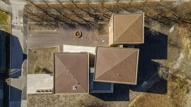
The project is divided into three cubic volumes, reducing the building’s visual impact - and downsizing it to harmonize with the area’s character and existing typology. The cubes are placed in different angels, creating a variety of spaces between them, as well as providing each hotel room with daylight and unique views. The hotel corridors are connected through glass bridges that link the cubes together and also bring an architectural experience to the corridors. From the bridges, there are great views to the beautiful surroundings. In the end of the hallways, open connected brickwork reveals light and peeks to the outside. Both the interior and the exterior enrich the hotel with spatial experiences, where guests and visitors can discover variations in space, light, and materiality.


The ambition of the project was to create a durable building of high-quality solutions - which ages with dignity. This ambitious goal has been implemented through the design process resulting in a level of detail with millimeter precision. There has been a particular focus on the transition between the interior and the exterior. By the glass bridges, the brickwork is visually laid seamless from the facades into the corridors - creating a subtle transition between the inside and the outside. The brass bay windows give the illusion of drifting in the facades, with no visible joints or transitions, while the rain gutters are integrated in the brick work as an architectural element.

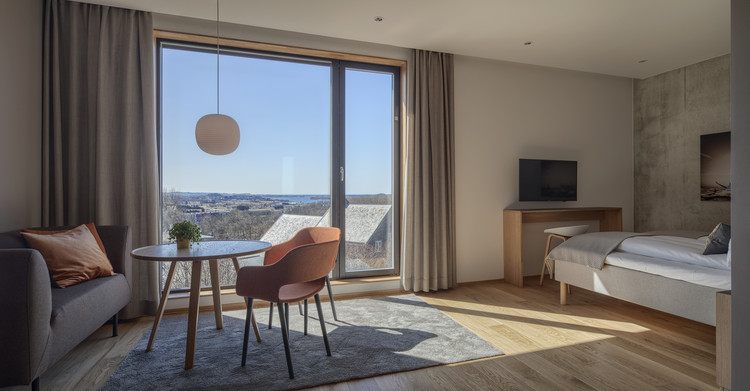
The interior spaces are inviting with warm colors and materials, with a clear connection to the surroundings through large window openings. A combination of purpose built, and design furniture creates flexibility in the interior space. The rooms are characterized by extensive use of wood, with a combination of concrete and oak parquet on the floors. There is a consistent use of durable materials, without the use of superficial décor. Quality-oriented, well-made solutions constitute the overall theme of the interior as in the rest of the project.


